Oakland Cemetery: Mobile App Redesign
Case Study Overview
Oakland Cemetery is a historic cemetery and one of Atlanta’s largest public Parks. The company objective is to restore the grounds and be a cultural resource to Atlanta. They have a website that has been recently updated. They also have a mobile app.
We wanted to redesign the Oakland Cemetery mobile app because the current app is buggy and difficult to use. The challenge was finding out what users needed from a new app to improve their experience at the cemetery.
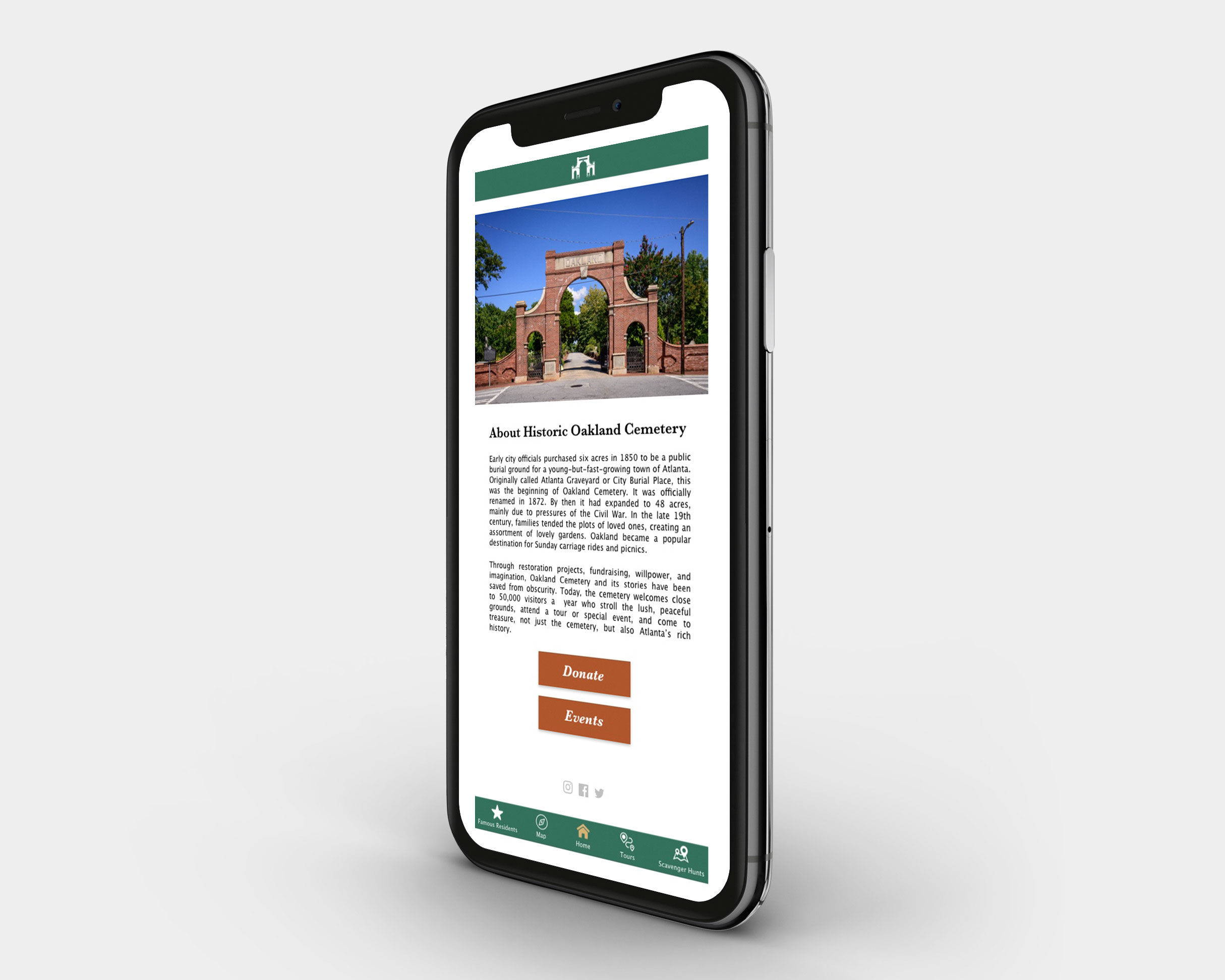
Historic Oakland Cemetery Mobile App, Mock-up of Home Page
Photograph by John Lunsford
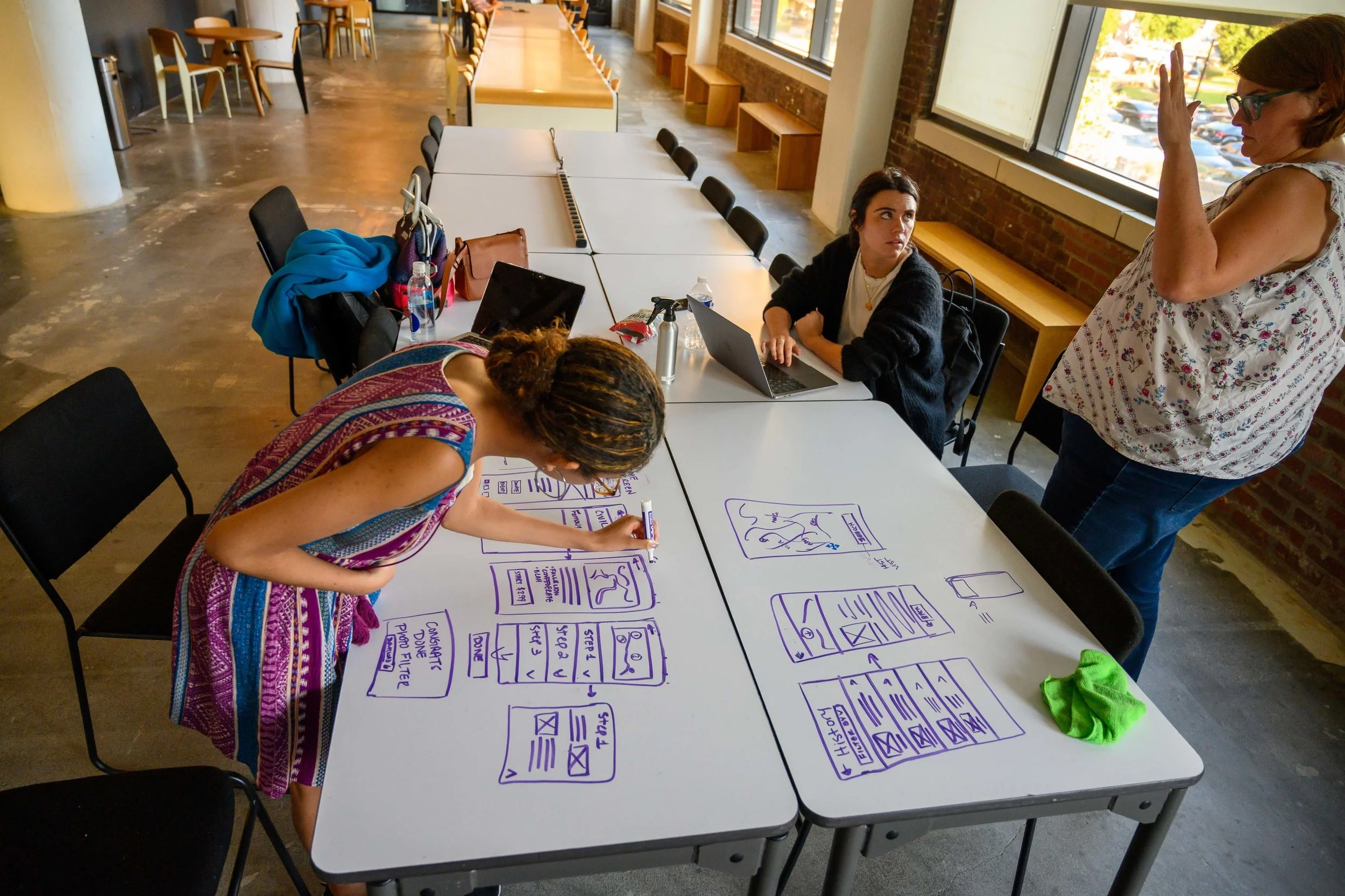
UX Team members from left to right: Ashlea Averso, John Lunsford, Kimoy Marin, and Margaret Williamson
Methodologies Used: Discover, Define, Develop, and Deliver
Project Scope
Platform: Mobile Application
Timeline: 2 Weeks
Tools: Sketch, Illustrator, Google Slides, Google Sheets, Slack, Post-its, paper, pencil, dry erase boards, markers
My Role: In this project, my role involved helping with the user research. This included collaborating on questions for the screener survey and phone interview. Visiting the cemetery, interviewing members of the staff about the app and cemetery’s goals. Affinity mapping all of the research (screener survey, phone interview, comparative analysis). Sketching out the wireframes for the mobile app. Also conducting some of the user testing.
The Problem
The existing app doesn’t meet the needs of the visitors or the foundation.
The Existing Mobile App
App lags a lot between tabs/when trying to click on another tab in the navigation bar. The app usually crashes when trying to use the ‘Map’ page or purchase a tour on the ‘List’ page.
Images and notations of existing Historic Oakland Cemetery Mobile App
“This has never been a user friendly app but today it got worse, with site blinking out. Despite an update today, it continues to blink out. ”
Solution
We believe that by revamping the Oakland Cemetery app with free + paid self-guided tours and scavenger hunts for visitors, navigation will be clearer and they will have easier access to historical information.
Research Process
Business Analysis
Below are the 5 apps we used to carry out a competitive analysis. The Heritage Civil War tour app and the Atlanta Travel guide app were chosen because they had information about guided tours. The Civil War Tour app actually has self-guided tours on the app. We chose Snapchat and Instagram because Oakland Cemetery’s users seem to have a high level of social media engagement. Those 2 are photo sharing social apps and we thought there may be an opportunity to include those features in a re-designed app.
Key Insights:
A lot of the features for Oakland Cemetery’s app are not functional
Most of the apps had a map, but no real time navigation
Every app, but Oakland Cemetery’s existing app was easy to use
Five apps used in Competitive Analysis. From left to right: Historic Oakland Cemetery app, Atlanta Travel Guide, Heritage Civil War Tour, Snapchat, and Instagram
Heuristic Evaluation
The Heuristic evaluation revealed that the Historic Oakland Cemetery app scored the lowest across the board.
Screener Survey
We sent out a screener survey and received 31 responses. Below are some of the questions we asked in the survey and the responses. After the screener survey, we chose 4 people to do phone interviews. We wanted to make sure to include a diverse age range and number of times someone’s visited the cemetery in our choices for the phone interview. Of the 4 we selected, 3 agreed to do a phone interview.
Images of questions and results from Screener Survey about Oakland Cemetery
Research Synthesis and Affinity Mapping
We created an affinity map of our screener surveys and the notes from the phone interviews. Here are some of the key insights below:
Most of the people going to Oakland Cemetery are return visitors
They don’t know that Oakland Cemetery app exists
They are concerned about tour length
They’re interested in historic information while they’re at the Cemetery
They struggle with navigating through the cemetery
They’re frequent photo takers, but are satisfied with the existing photo apps they have
Personas
The results from our screen survey and phone interviews created the base for our personas. We used the insights from our affinity map to create their needs and pain points.
Alex
History buff who always brings friends & family to local, historic places so he can teach them about the history there. He loves Oakland Cemetery and all the history it has to offer - especially anything about the Civil War.
Needs
Access of historical information
Ability to navigate easily through the cemetery
Diverse options of tours
Ways to show groups around
Pain Points
Not being able to choose the historical information he wants to see
Not enough detailed information about historic sites
Unclear timeframes of tours
Melissa
Stay-at-home mother of three young children. Always looking for different things to do to entertain & educate her kids outside of the house. Likes to post photos of fun things they do to social media (i.e., Instagram).
Needs
A fun way to explore Oakland Cemetery
A way to entertain & educate her kids
Wants a cute way to document her children experiencing the cemetery
Pain Points
Not knowing how to navigate the park with children
Tours can take too long
Has trouble keeping her children’s engaged
User Flows
After creating the user personas, we sketched out the user flows together on a table based on the needs of the users and what their goals would be. The user flow people is an example of a happy path for Alex. It walks you through Alex buying a self-guided tour.
Final version of user flow chart
Design Process
Wireframe Sketches
After creating the user flows, we sketched out the wireframes on a table together. We wanted to sketch out screens that the users would need to carry out and complete their tasks. After agreeing on the screens, I drew out more detailed wireframes with annotations.
Wireframes, User Testing, and Iterations
After creating the sketches for our mobile app. Our team did 2 rounds of user testing. First, with low-fidelity wireframes and then with medium fidelity wireframes. Below are images of iterations we made for key screens in the app.
Home Screen and Iterations
Below are the different iterations of the home page. After creating the low-fi wires, our team carried out user testing. Some of the feedback from that was to have clearer social media buttons. We did our second round of user testing with the Medium-fi wires. A key insight from testing the home screen was that the app felt more like a mobile website as opposed to an app.
Images of Home Screen, showing the various iterations from Low-fi to The Current State
History Screen and Iterations
Below are the low fidelity wires for the history page and the current state. During user testing, users voiced frustration with having to hit the back button multiple times when trying to navigate back to the home when on different screens. This led to the A/B Testing we conducted to find a solution for getting back to home.
A/B Testing
After our second round of user testing. An overwhelming number of users mentioned having to click back too many times to get back to the home screen. We came up with 2 options to solve for this problem “Option A” was a Home Button at the top of the nav bar along with a back button. “Option B” was a sticky nav that would be available on all of the app screens. The result of the A/B testing was that Option B, a sticky nav bar, was preferred over Option A.
Clickable Prototype
Next Steps
More iterations & user testing
Adding an account option for users to save purchased tours
Improve donate & events features
In-app ticket purchasing for events
Enhance photo filters and photo options
Further develop app!
Reflection
This was my first UX project working in a group. We did a great job collaborating on the research and planning a timeline for goals. If we had more time on the project, I think it’d be a great opportunity to look into why return visitors don’t use the app/aren’t aware that Oakland Cemetery has an app. They have a lot of signage for the app around the park so I think we’d need to focus on an alternative way to advertise the app to visitors.


