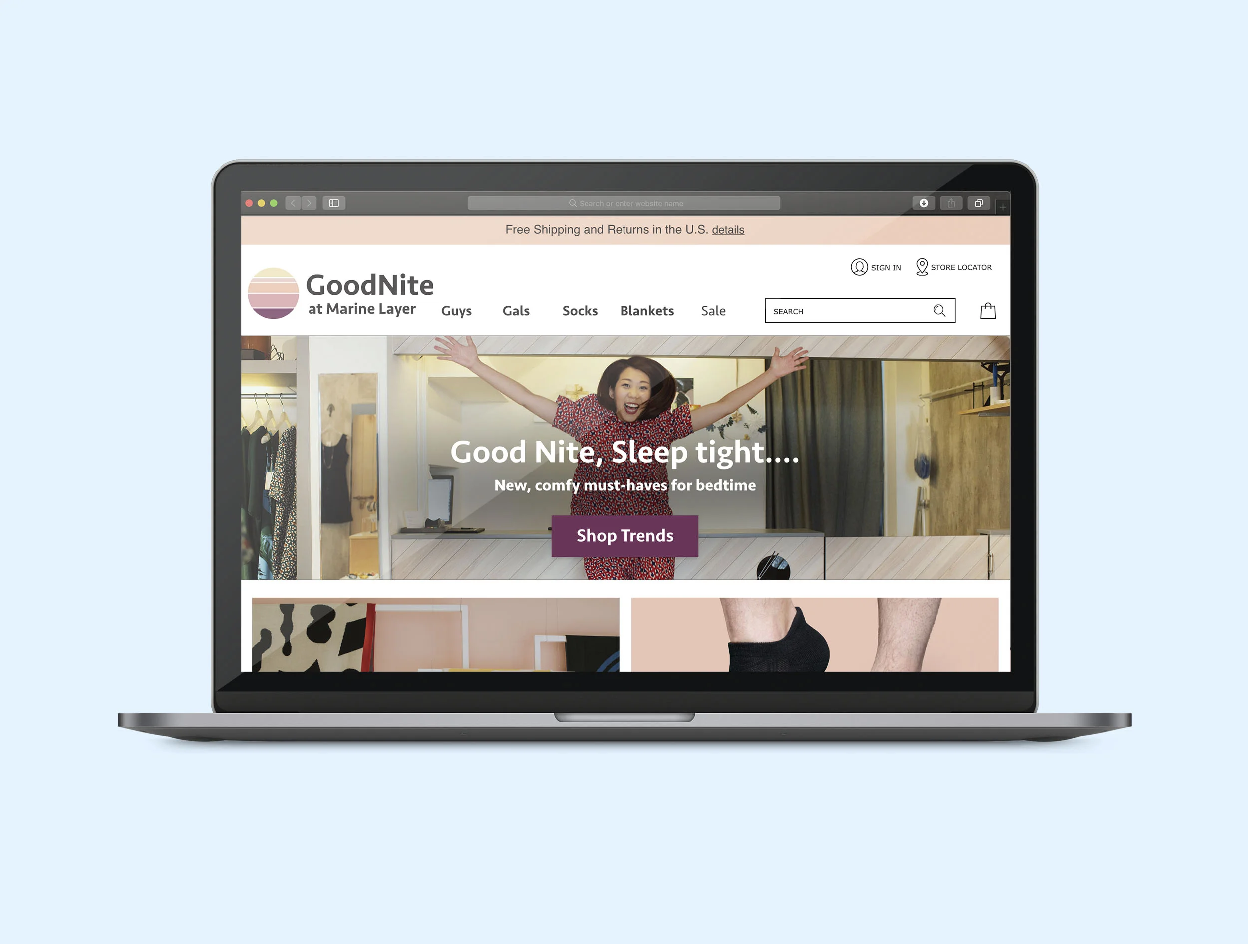
Goodnite At Marine Layer Microsite
Case Study Overview
Goodnite by Marine Layer is a microsite by Marine layer that sells cozy items for sleeping and relaxing. The challenge was to create a microsite that meets the goals of the user and the business.
Project Scope
Platform: E-Commerce Website
Timeline: 2 Weeks
Tools: Adobe XD, Illustrator, InDesign, Photoshop, Keynote
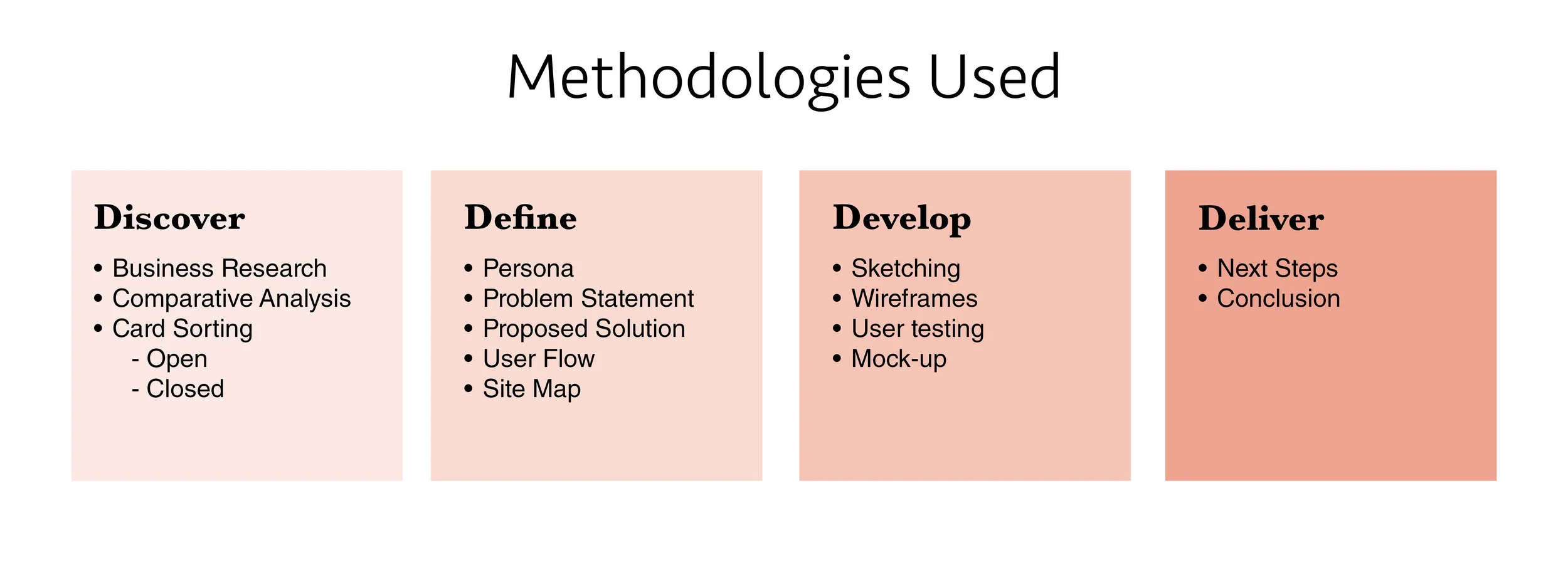
My Role: This was an individual in-class project, my role included using a number of research methodologies to determine the problem and proposed solution. For the design aspect I created wireframes, carried out 2 rounds of user testing, and made iterations and created a mock-up of the home page. The ‘Methodologies Used’ section has a more detailed list of the work carried out in each phase of the process.
Brand Research
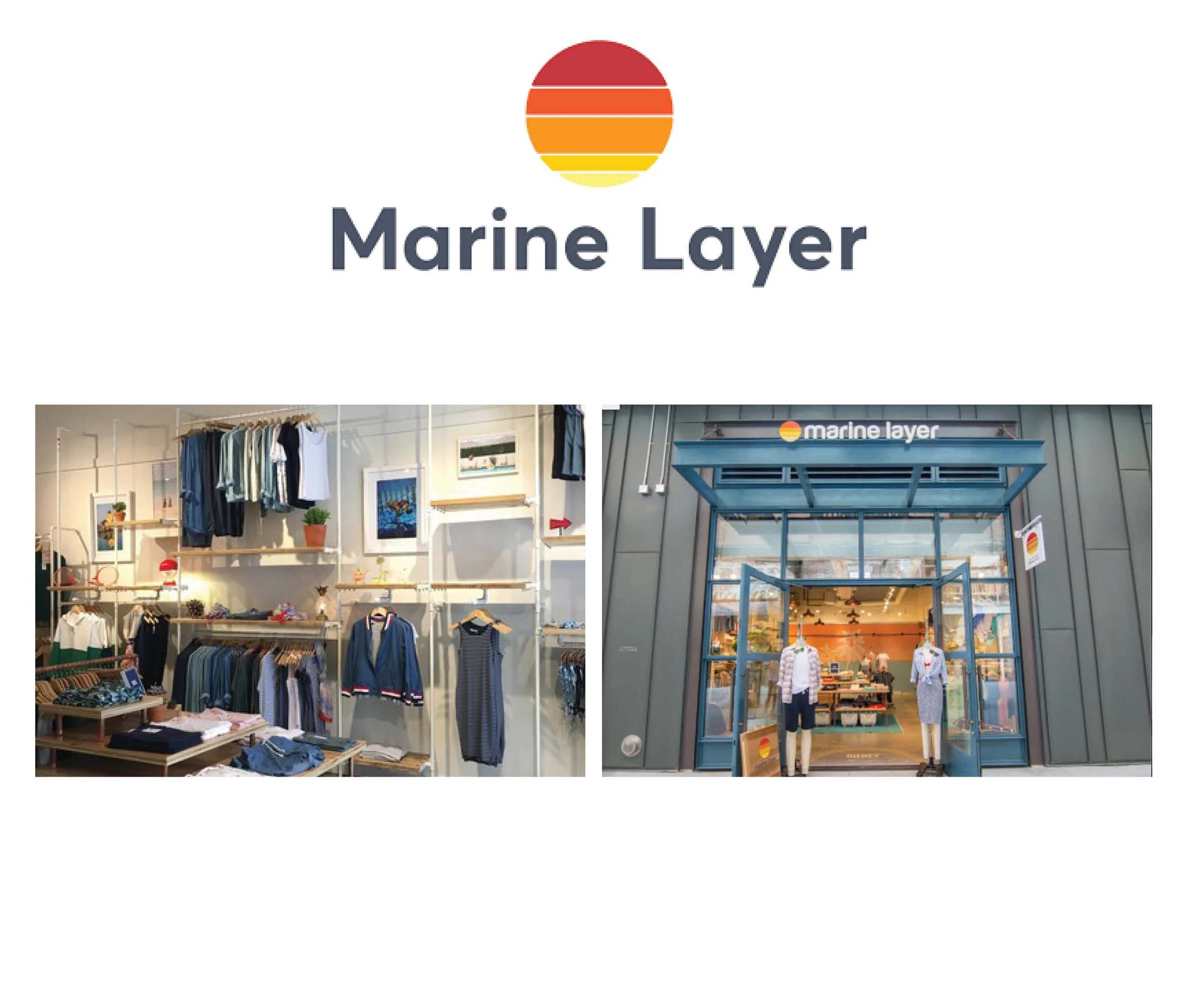
Marine Layer is a California-based company that makes sustainable clothing from materials that are ethically sourced. The founder of the company created the company from a desire to have a super soft t-shirt the moment you buy it. There’s an emphasis on fabric softness and sustainability.
“I wanted to recreate a shirt that would feel like my old favorite from day 1, so I wouldn’t have to worry about anybody taking liberties with my closet + a trash can”
I went to Ponce City Market store. It has a very beachy vibe. Most of the decor is white with teal accents. There’s a mixture of wood and metal for the shelving/displays.
The website for Marine Layer has a beach-y west coast feel. They use casual and conversational jargon on the site. Labeling the men and women’s sections “Guys” and “Gals”
Why Sleepwear? Why Goodnite?
An important aspect of Marine Layer’s brand is comfortable, sustainable clothing. They have a limited selection of socks and don’t currently sell any sleepwear or blankets. A section for sleepwear and comfortable items, like socks and blankets, aligned with their brand identity and was a good way to utilize their existing materials for a microsite.
Persona
Randy Blue
Age: 39
Location: San Diego, California
Occupation: Cinematographer
Randy is an existing Marine Layer customer. He has a 14 year-old daughter. Randy and his daughter Margot, have recently gotten into foreign films. They have designated their Fridays for movie nights. Randy hopes their new hobby will mean Margot thinks he’s cool. Sometimes they fall asleep on the couch, so they want to be as cozy as possible.
Needs
To know what’s new on repeat visits
Social proof from others to know what’s cool
A feeling of relationship with the brand
Reassurance by familiar brand names
Pain Points
Lack of sufficient product information
Difficult navigation
Expensive or unclear shipping charges
Lack of trust with unfamiliar retailers
The Problem
Randy needs a way to shop for new products in sleepwear for movie nights with his daughter because he wants to be trendy and comfortable.
Solution
We believe that by creating a designated section for new items and clear categories for Randy, we will achieve easier navigation and provide more product information.
Goodnite At Marine Layer
Key Features:
User account allows you to save items to purchase later
New arrivals advertised on home page
Partnerships with well-known brands
Free Shipping and Returns in U.S.
Shop-able Collections based on trends
Research Process
Comparative Analysis
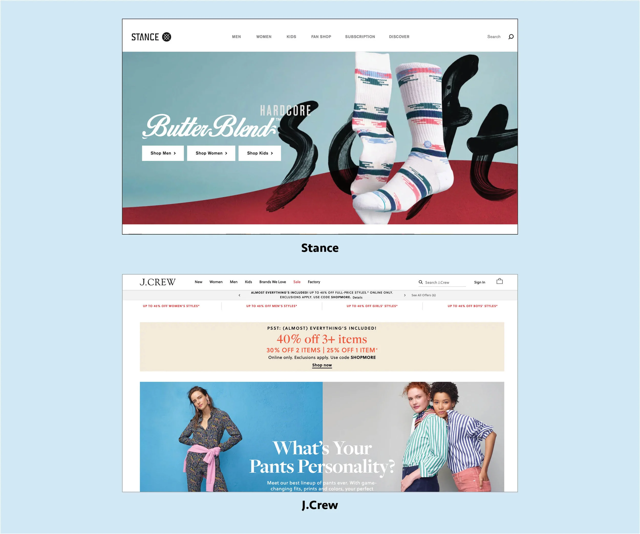
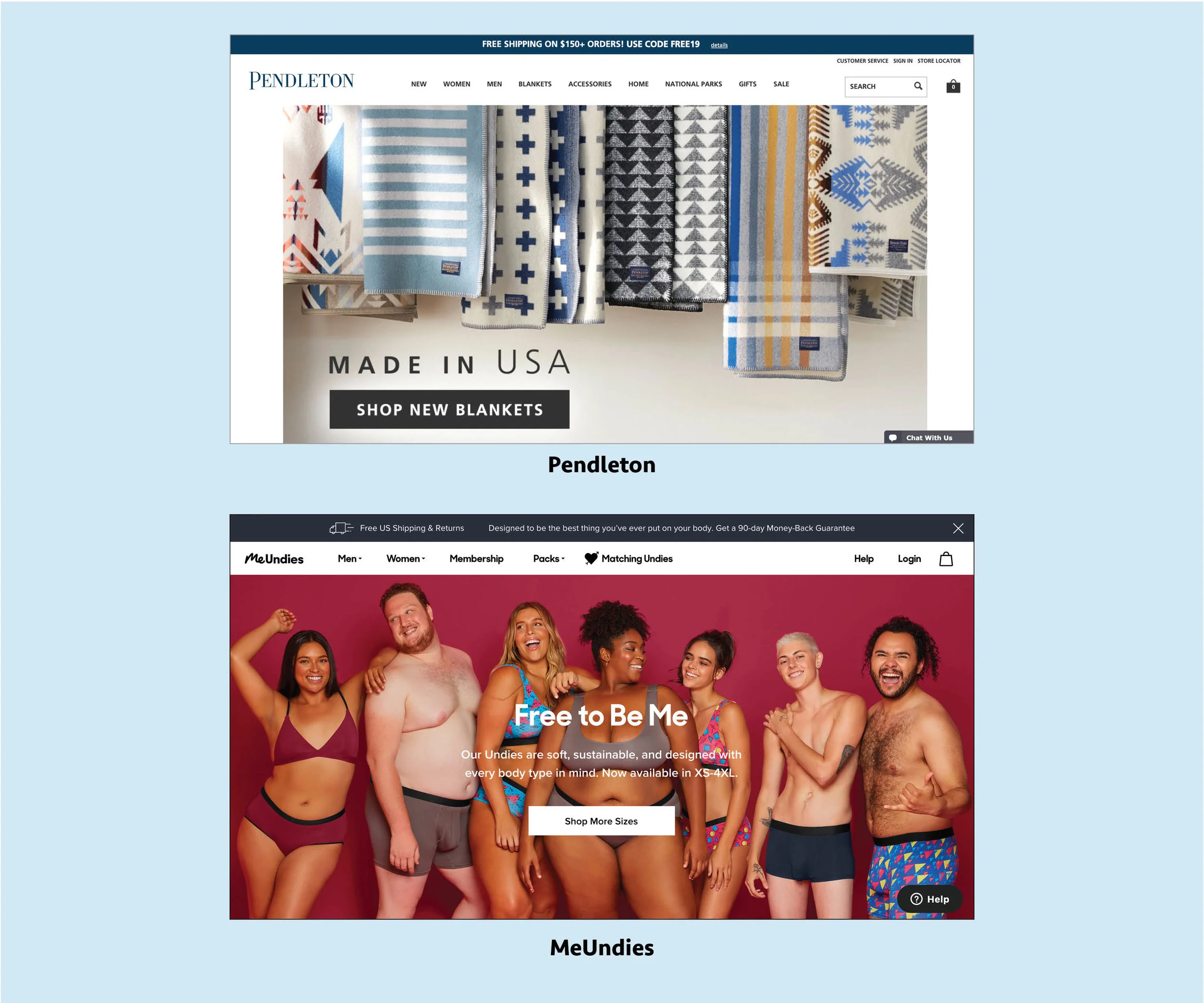
For the comparative analysis I picked companies that sold items similar ones that would be sold in the microsite. Two are brands that are trendy. They use social media influencers and partner with major brands in sports and pop culture.
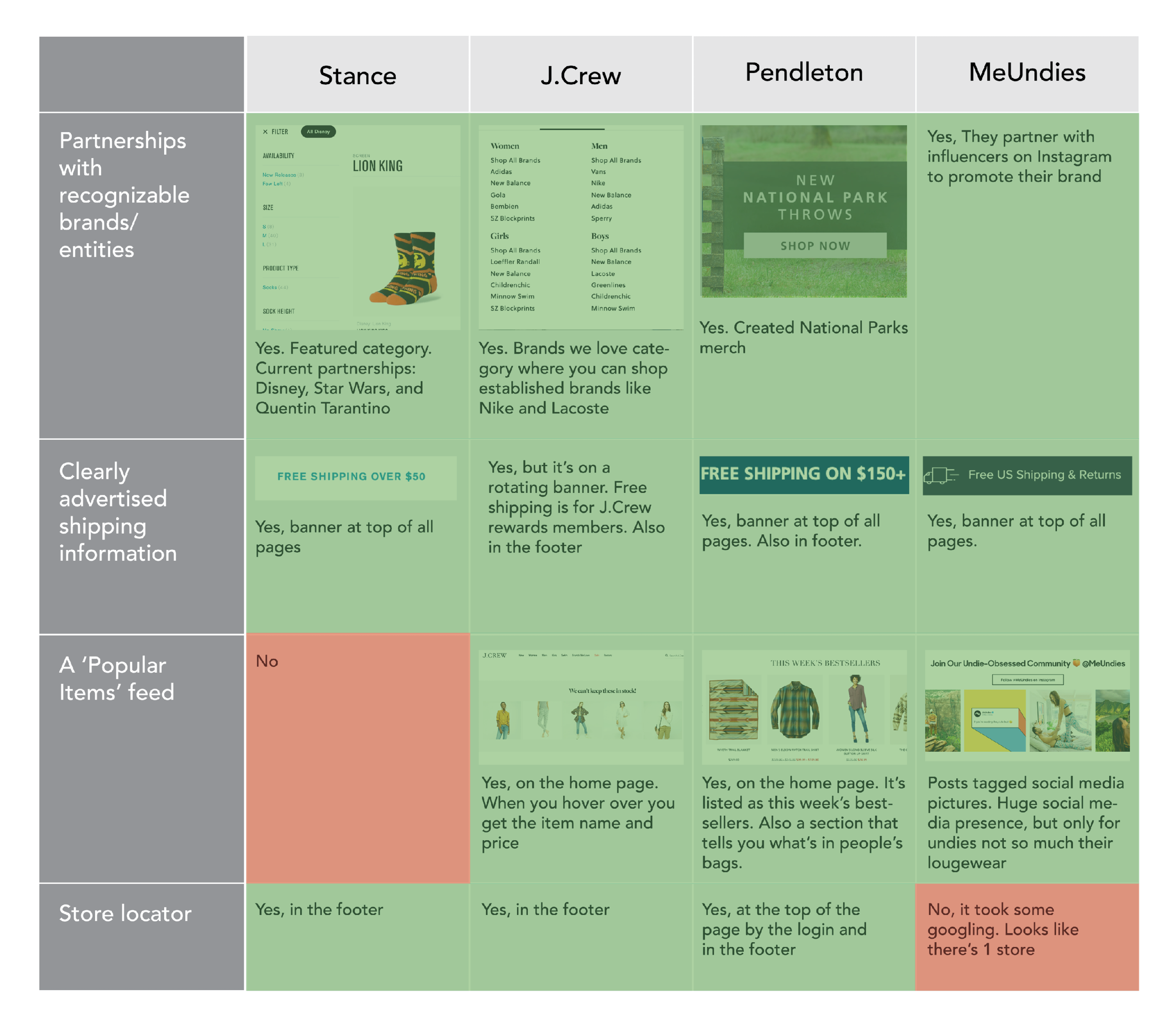
I looked at 4 things when comparing these companies:
How clearly was shipping advertised?
Did they have partnerships with other brands or entities (Ex: Lion King, influencers, other companies)
Was there a popular feed?
Was there a store locator?
Open Card Sort
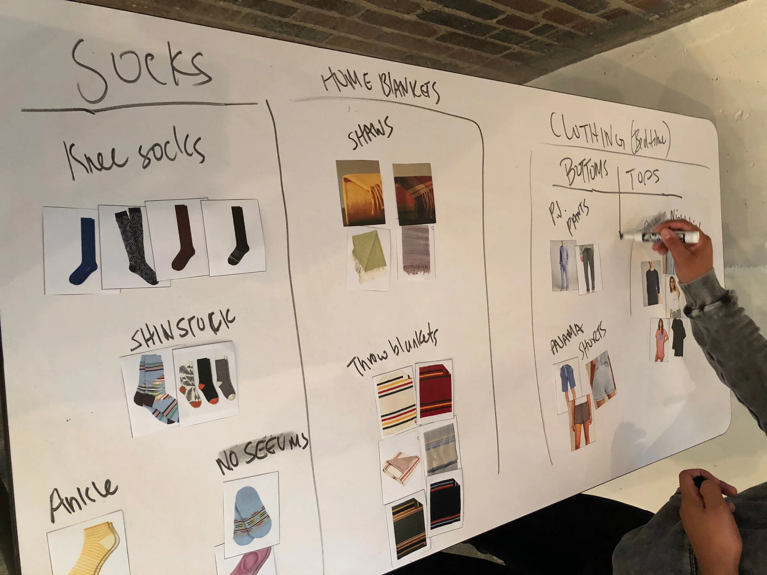
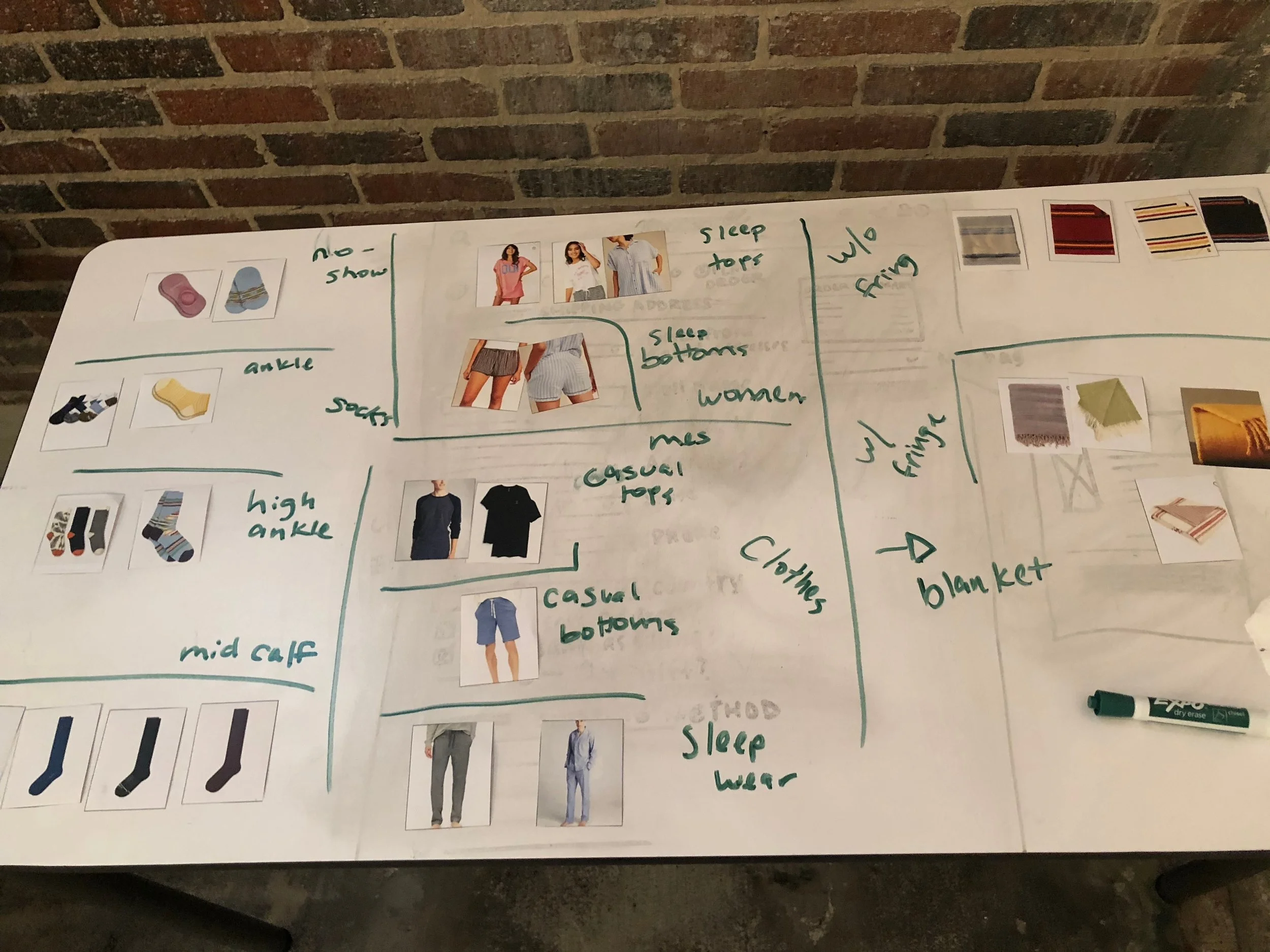
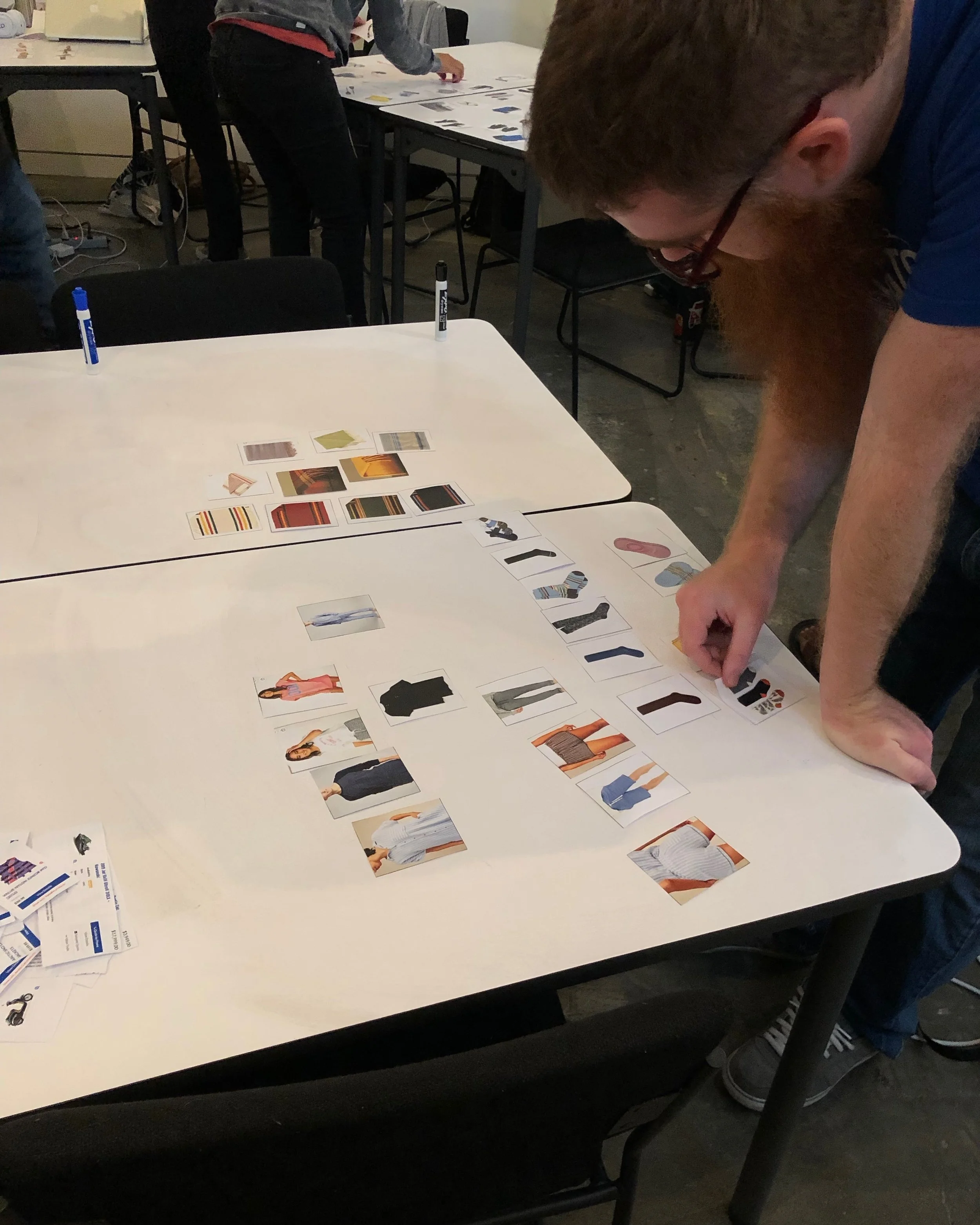
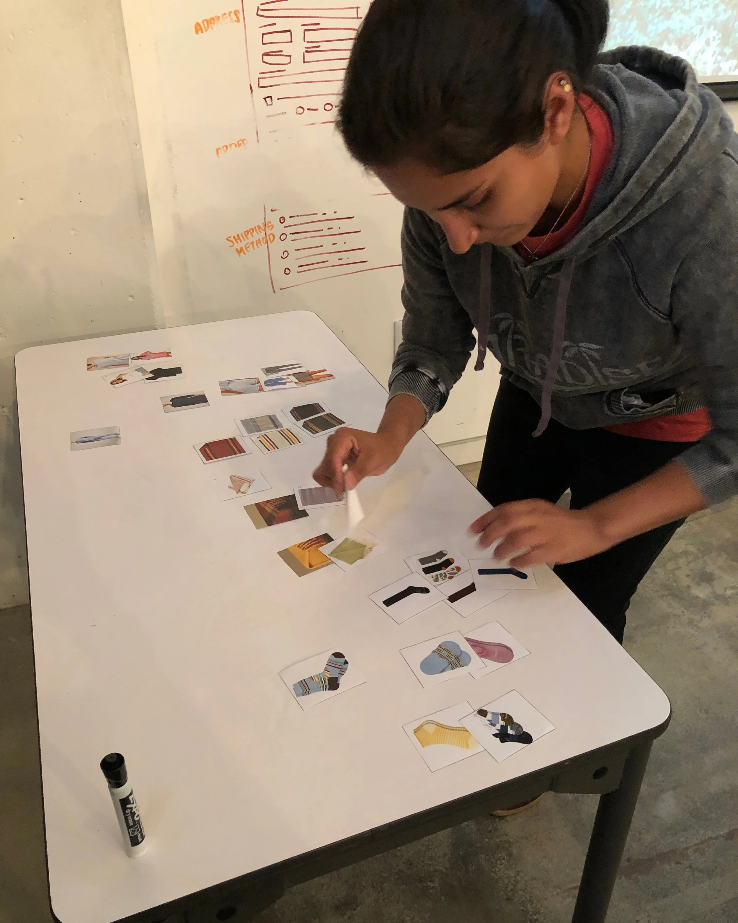
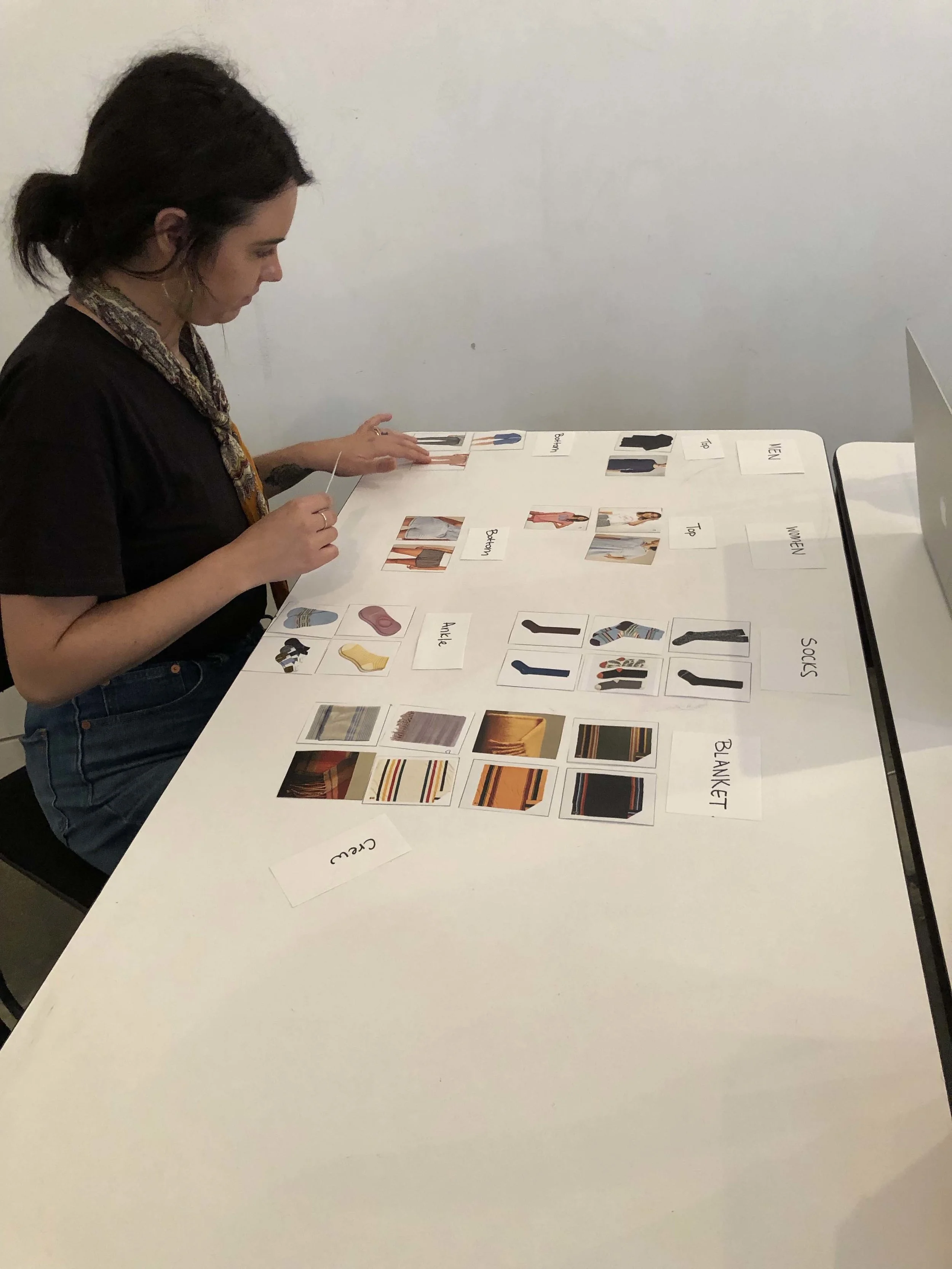
For the open card sort I created card images of 30 products that would be sold on the site. They consisted of pajamas, socks and blankets. I provided those images to the users without any set categories. I performed 6 open sorts.
Key Insights:
All users categorized the socks by length
Most users categorized the sleepwear by ‘tops’ and ‘bottoms’
Most also categorized sleepwear by ‘men’ and ‘women’
Blankets had a lot of variations in the way they were categorized by users
Some users categorized blankets by ‘patterns’ and ‘solids’
Some categorized blankets by ‘fringe’ and ‘no fringe’
Closed Card Sort
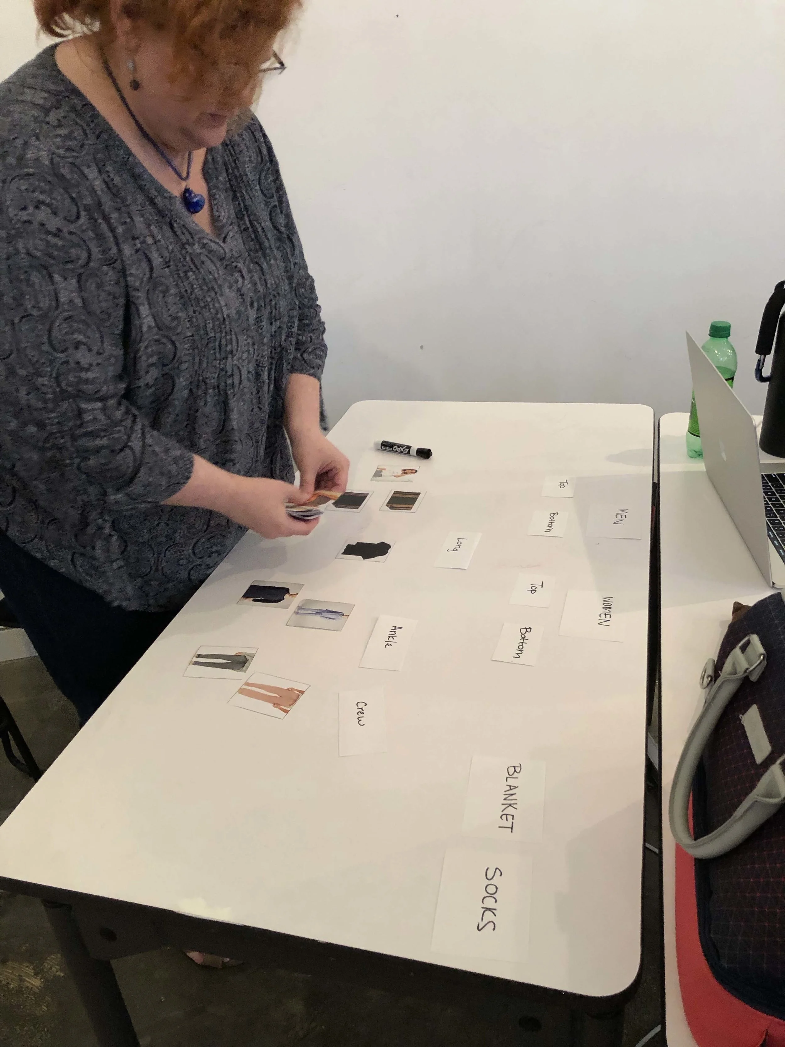
Conducted 3 closed card sorts. I provided 30 items for the closed card sort with 4 category title cards and 7 subcategory title cards. I gave the users the same images and the titles cards to sort the items by the provided categories.
Key Insights
Subcategories for socks made sense/easily understandable
Users correctly categorized socks by length
Men’s pajama set was confusing with the ‘Top’ and ‘Bottom’ categories, removed pj set
Blankets were easy to sort
Site Map
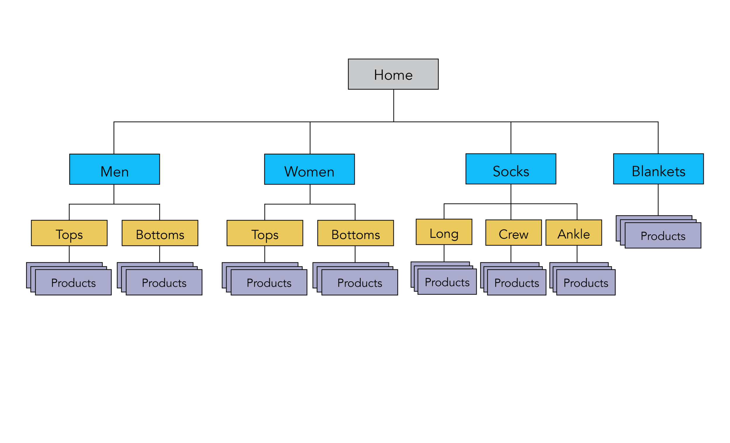
The results of the open and closed card sort led to the categories used to create the site map.
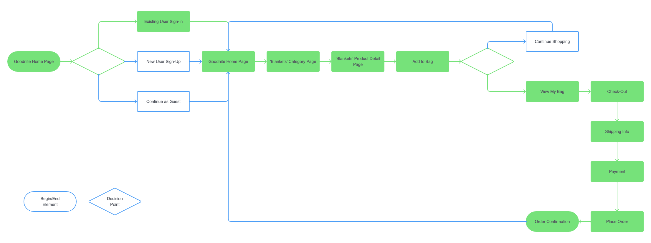
Intended User Flow
Design Process
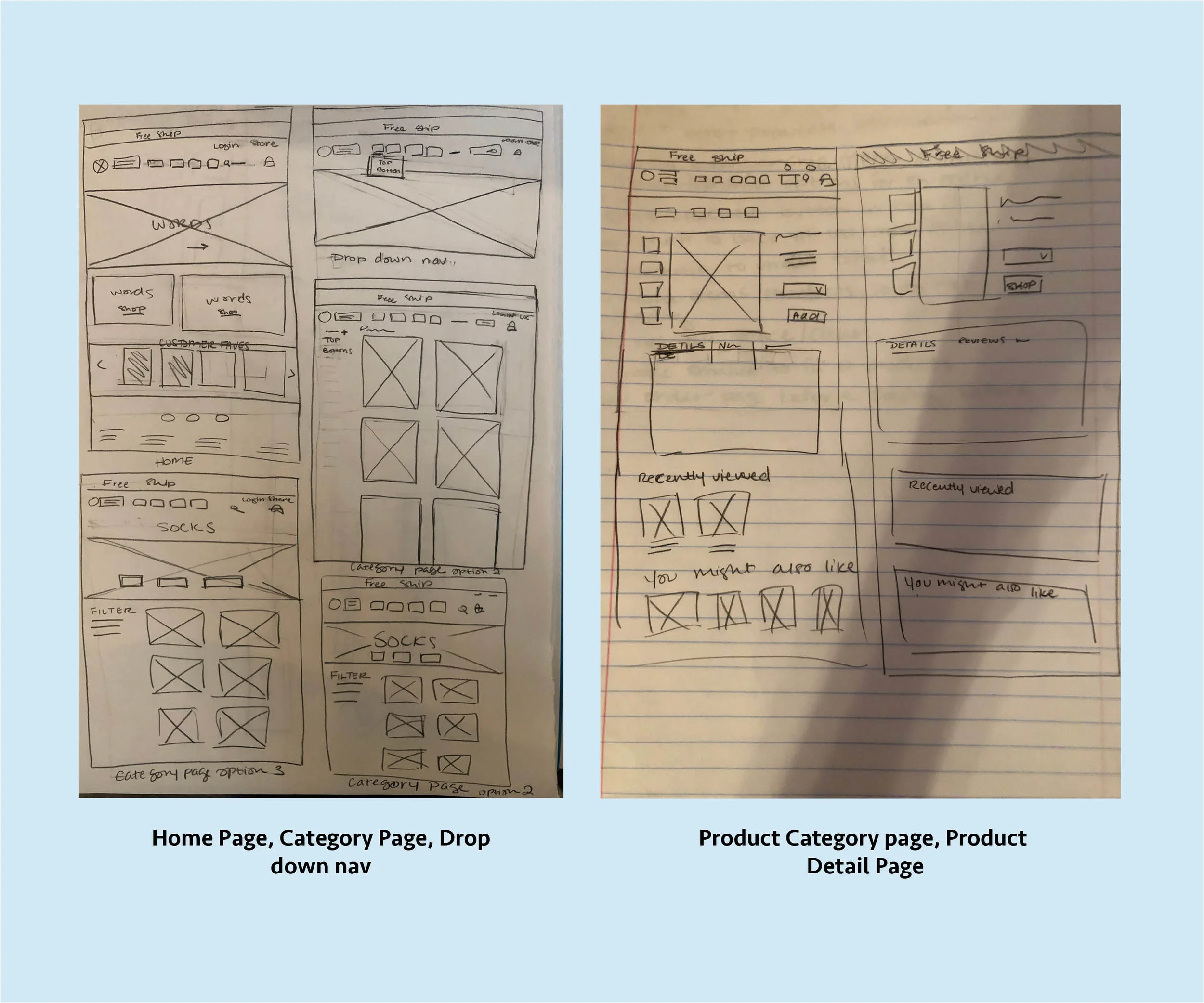
Sketching
Round 1: Wireframes and User Testing
I tested the first round of wireframes with 2 people. I noticed similar issues and questions with the 2 users, the key insights from the testing are below.
Key Insights:
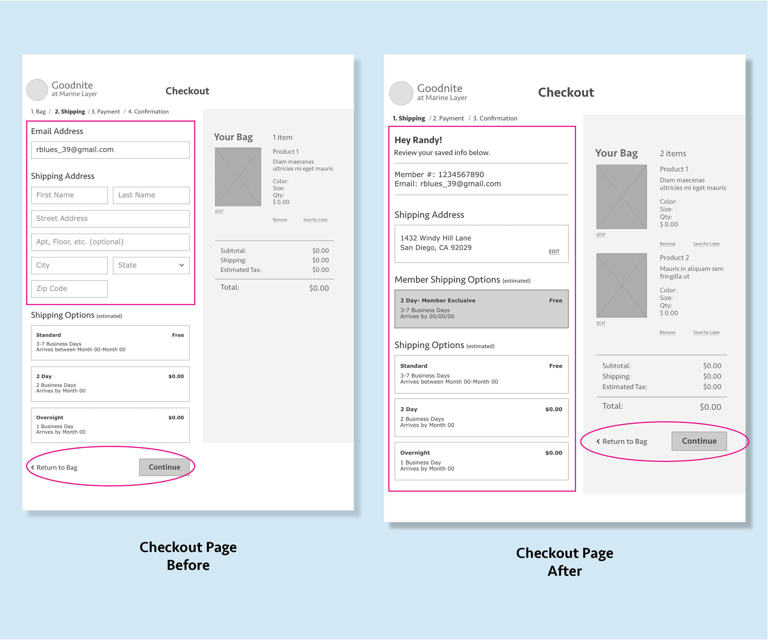
Confusion about whether your information would be save if you’re a returned user
Difficult to find ‘Saved items’
Have a review page before to confirm or cancel purchase before the final confirmation page
The buttons are too low on the checkout pages
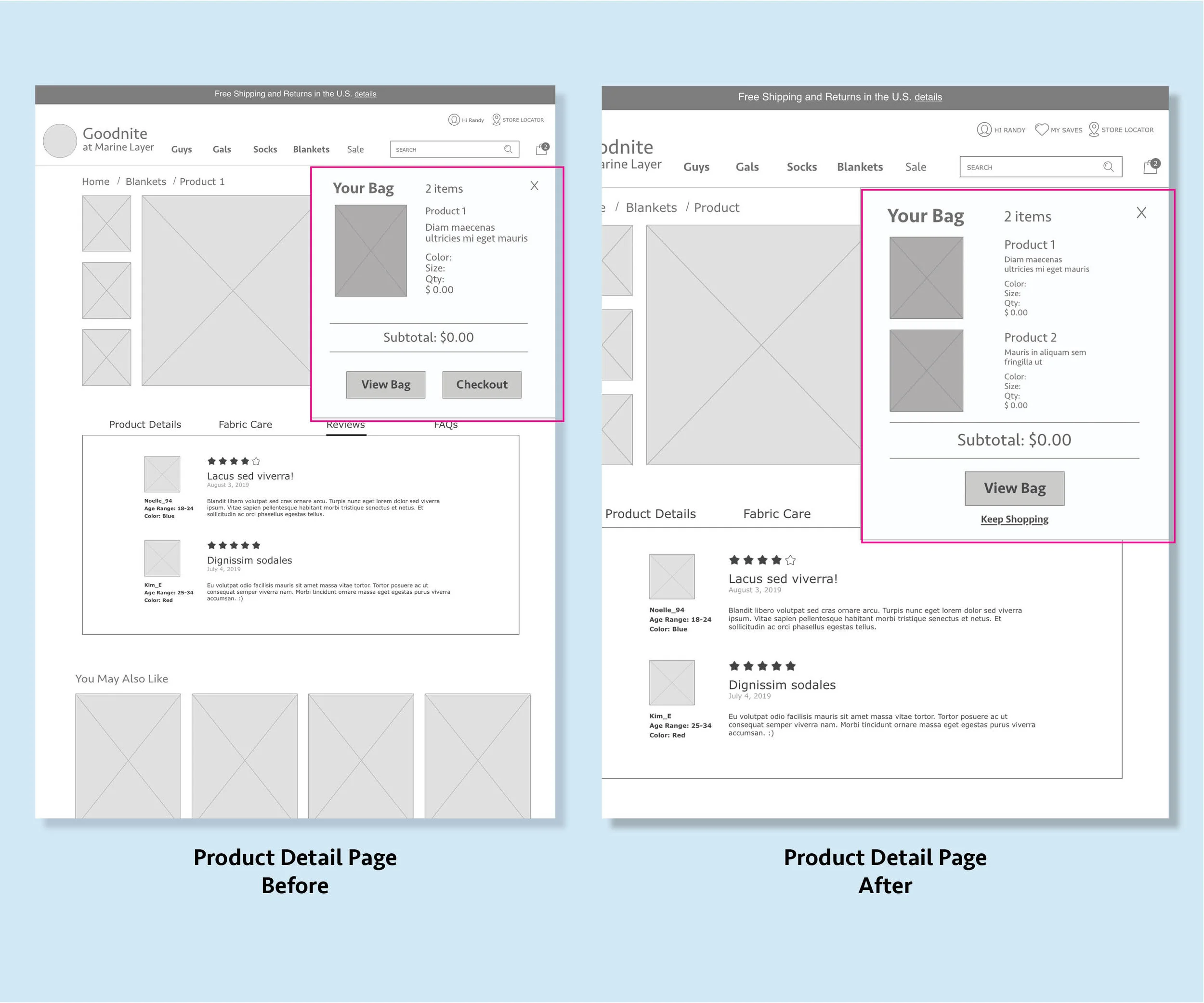
Have a ‘Continue shopping button’ in the Bag
Number of items in bag from the Bag preview window is unclear
Round 2: Wireframes and User Testing
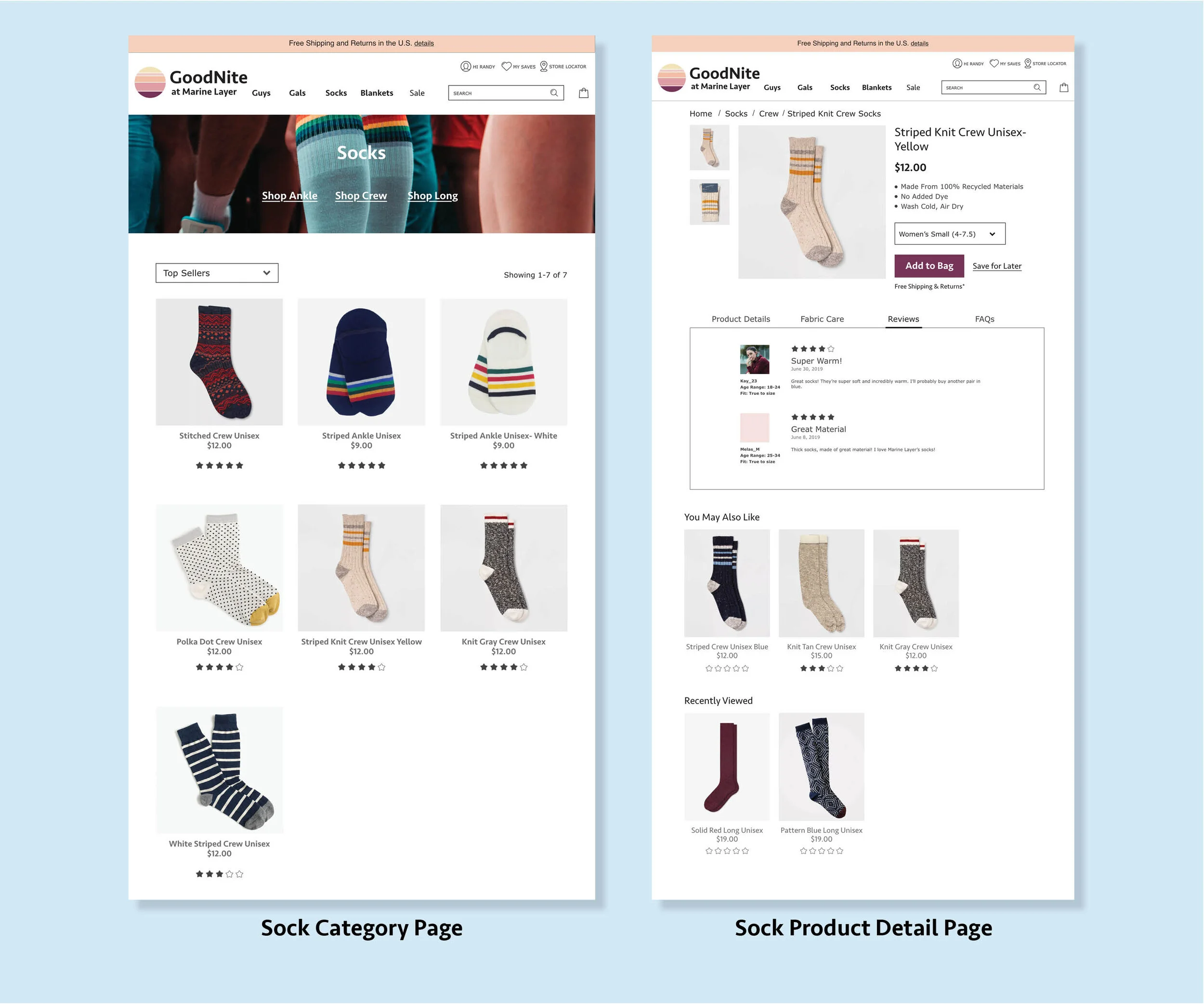
I tested the second round of wireframes with 3 people. There was more variety in the feedback from the testing. The key insights from the testing are below. Only one user mentioned adding customer reviews to the category page, this is something I want to do more testing on since it could benefit the company’s user.
Key Insights:
Include estimated arrival date on order confirmation page
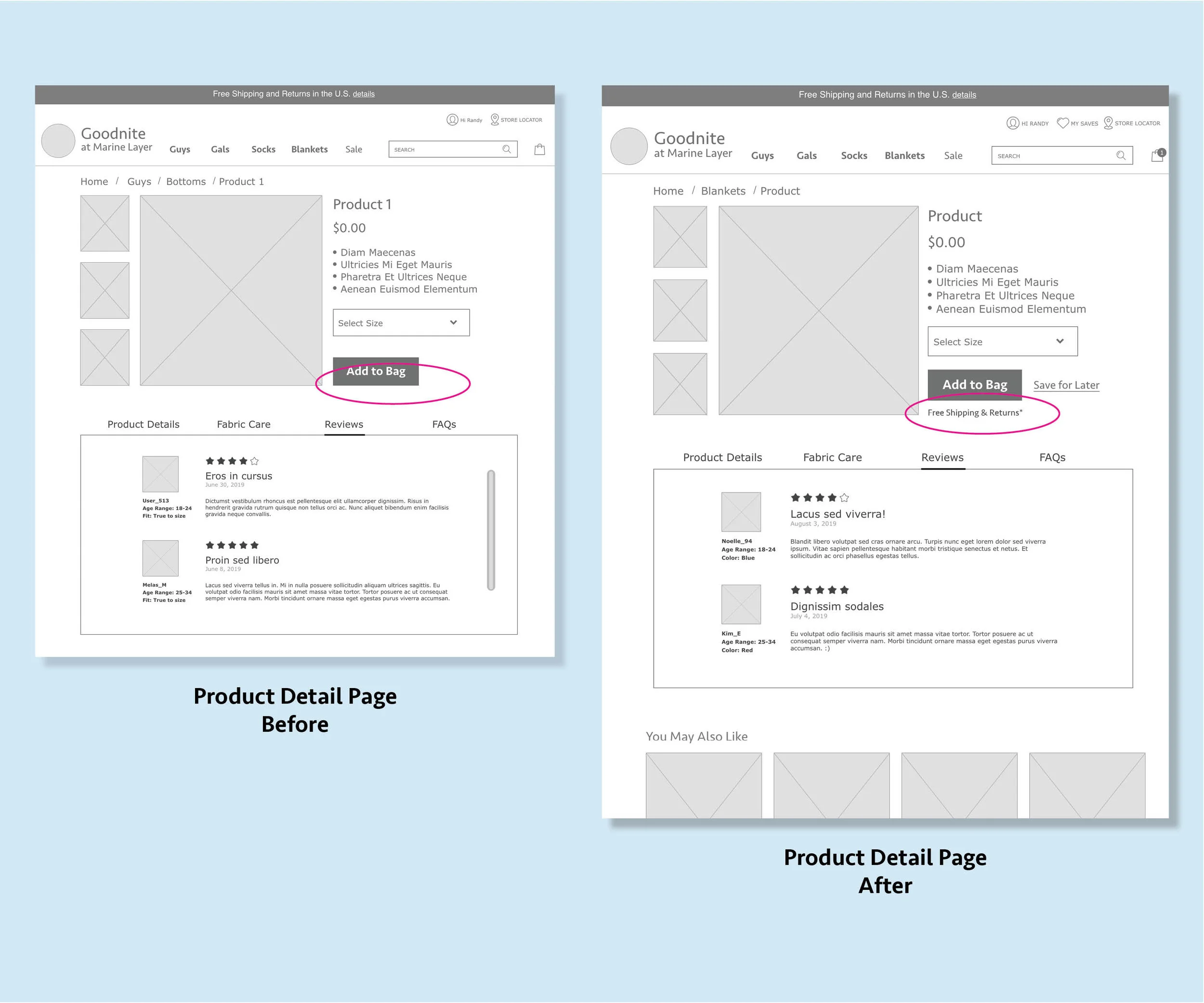
Include shipping offers on the Product Detail Page
Consider adding customer reviews to the category pages
Updated User Flow
I updated the user flow to reflect changes that I made after user testing. I added all of the screens that are now part of the checkout process. Also the pages goes back to the home page at the end of the checkout and confirmation.
Clickable Prototype
Here is a clickable prototype of the revised wireframes after the 2 rounds of user testing.
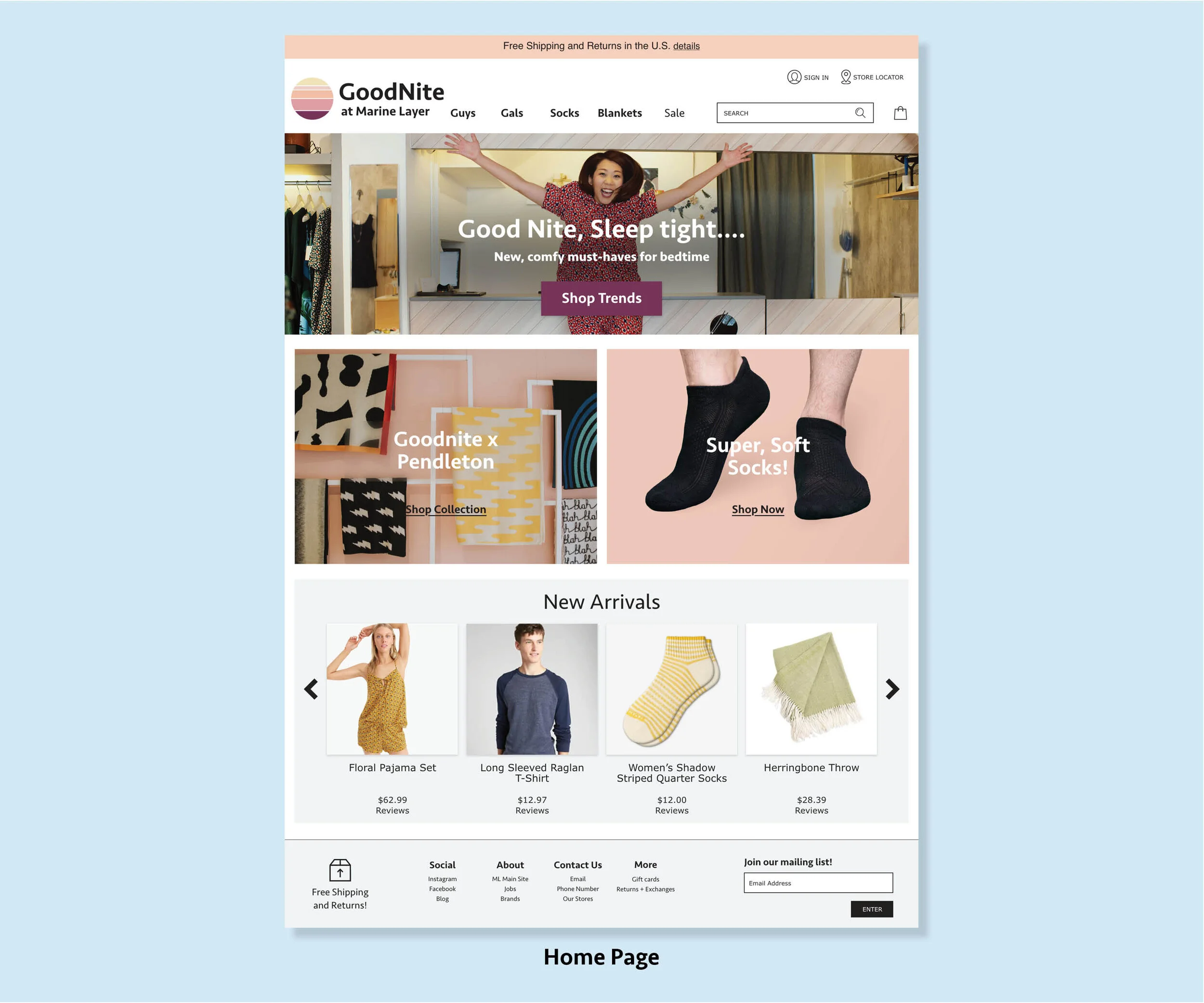
Goodnite Mock-Up
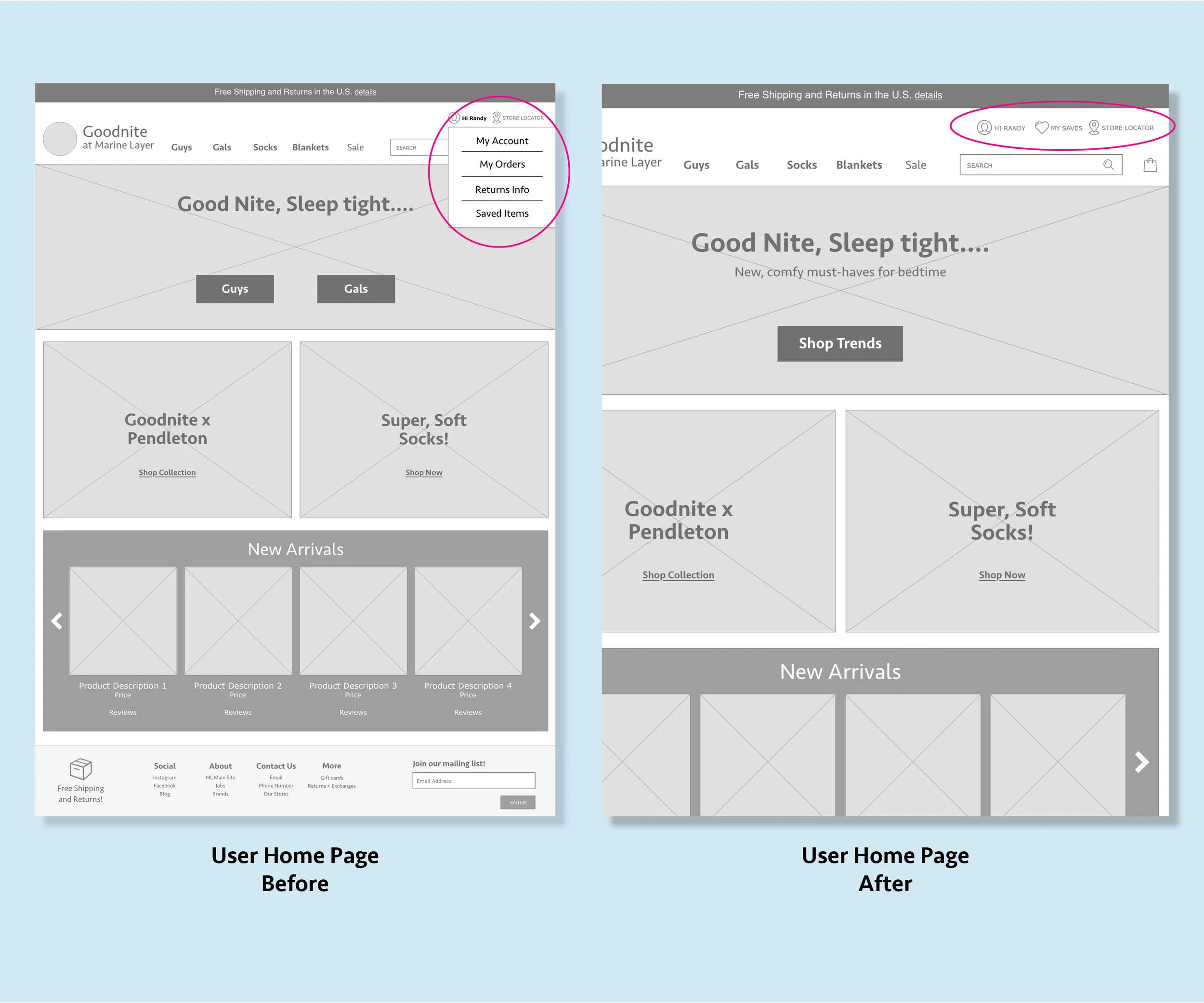
I’ve created mock-ups of the home page and drop down navigation bar.
Next Steps
Perform A/B Testing for customer reviews on the ‘Category’ Page
Build out and test other pages important to user
‘Order History’ Page
‘New Arrivals’ Page
All the Category Pages
Test category filters
Reflection
I enjoyed working on this project. Having an existing user, it was definitely a challenge figuring out how to align the business and user goals. The card sorting exercise and the user testing were fun to do. It was great to see other people’s perspectives on the same thing. If I had more time I would do more user testing. Specifically on the customer review feature on the category page. I would also want to refine my user testing script and also do some user testing with a different task to flesh out some of the other pain points my user had.

